Color is a powerful tool in shaping our perceptions, emotions, and even behaviors. Whether in design, marketing, art, or everyday life, colors can evoke specific feelings and influence how we interact with the world around us. From the calming blues that can soothe anxiety to the energizing reds that can grab attention, understanding the psychology of color enables us to make deliberate choices that affect mood and decision-making. By harnessing the emotional impact of colors, we can create environments, brands, and experiences that connect more deeply with people.
In the right hands, colors can shape moods, transform spaces, and influence decisions without a single word.
The psychology of color explores how different hues can affect our feelings and behaviors. This area of study is rooted in the idea that colors have inherent meanings and associations that can vary across cultures but often share universal effects. For instance, warm colors like red, orange, and yellow are known to evoke feelings of warmth, energy, and excitement, while cool colors like blue, green, and purple are often associated with calmness, relaxation, and stability.
These emotional associations make color a powerful tool for influencing perception. For example, brands use red to convey urgency or passion, while blue is used to foster trust and reliability. Designers, marketers, and artists can tap into this knowledge to shape user experiences, create specific atmospheres, and guide consumer behavior.
 A beautiful day to start all over again
Red is a dynamic and stimulating color, often associated with passion, excitement, and even danger. It can evoke a sense of urgency, making it a common choice for call-to-action buttons on websites or sales promotions. Red has also been shown to increase heart rate and adrenaline levels, which can create a sense of excitement or intensity.
In interior design, using red as an accent can energize a space, making it feel vibrant and lively. However, too much red can become overwhelming, leading to feelings of stress or aggression. To strike a balance, red is often best used in moderation, as a way to draw attention to key elements or create a focal point in a room.
Design isn’t just about what you see — it’s about how you feel, and color is the bridge between the two.
Blue is one of the most popular colors in design and branding, known for its calming and trustworthy qualities. It is often used by banks, healthcare companies, and technology brands to convey stability, reliability, and professionalism. Studies have shown that blue can lower blood pressure and slow down the heart rate, making it a great choice for spaces designed for relaxation, such as bedrooms or meditation areas.
In digital design, blue can create a sense of spaciousness and calm, making it ideal for backgrounds or interface elements that need to recede into the background. However, different shades of blue can evoke different feelings. Light blue tends to be more soothing and serene, while dark blue can communicate a sense of authority and strength.

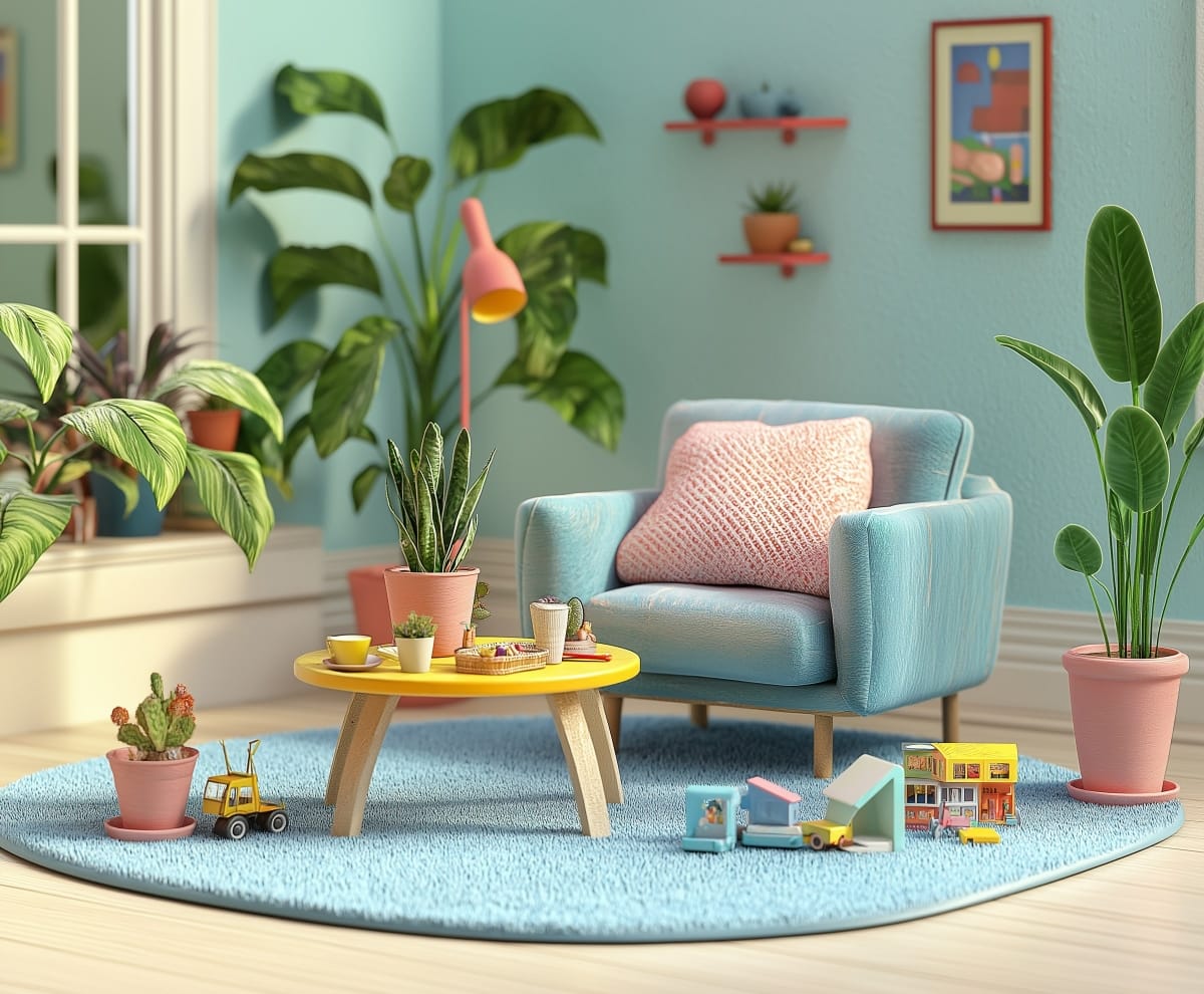
Yellow is the color of sunshine, often associated with happiness, positivity, and energy. It is an attention-grabbing color that can evoke feelings of joy and warmth, making it a great choice for spaces where creativity and social interaction are encouraged, such as kitchens or playrooms.
The hue of harmony and renewal
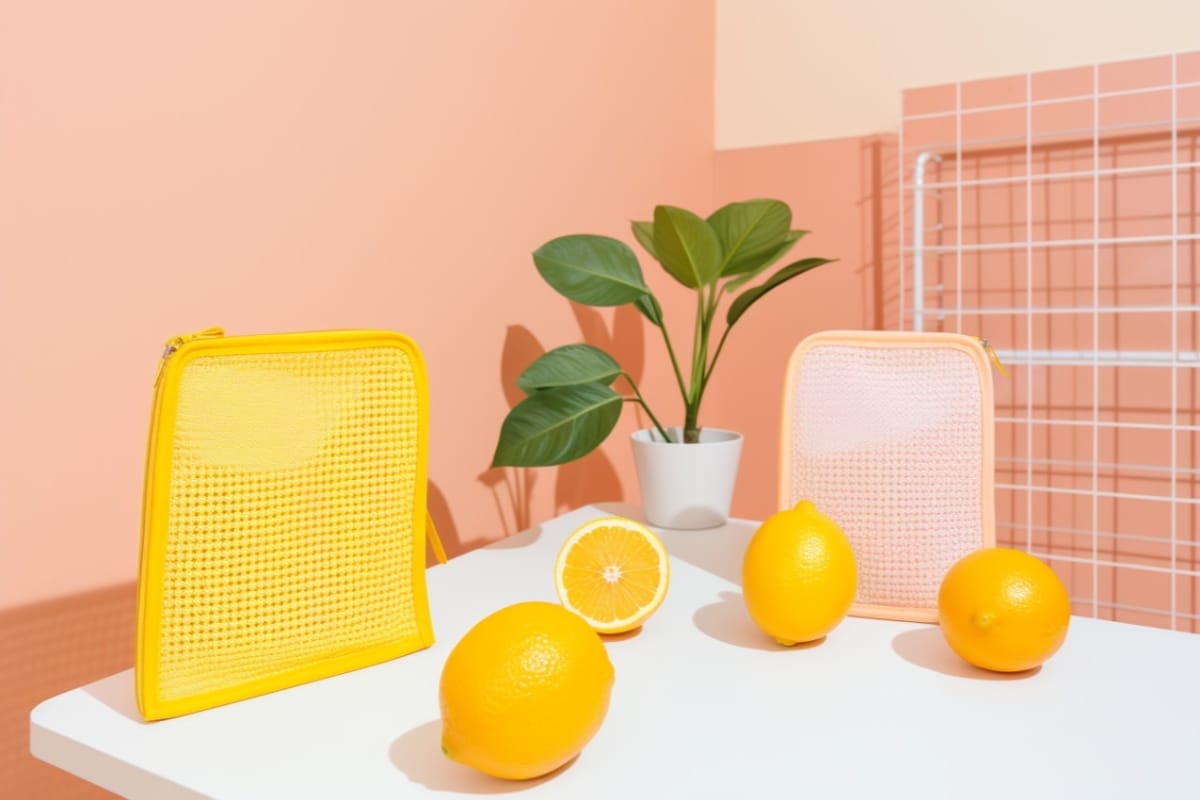
In branding, yellow is used to create a sense of cheerfulness and friendliness. It’s a color that can make products feel more approachable and playful. However, yellow can also be overwhelming when overused, potentially leading to anxiety or frustration. To use yellow effectively, it’s best to balance it with cooler tones or use it sparingly as an accent to uplift the overall mood of a space or design.
Green is often associated with nature, growth, and renewal, making it a symbol of balance and harmony. It has a calming effect, similar to blue, but with an added sense of freshness and vitality. This makes green an ideal choice for spaces that are meant to feel relaxing yet rejuvenating, such as living rooms, offices, or outdoor areas.


Start the conversation